UI/UX Design
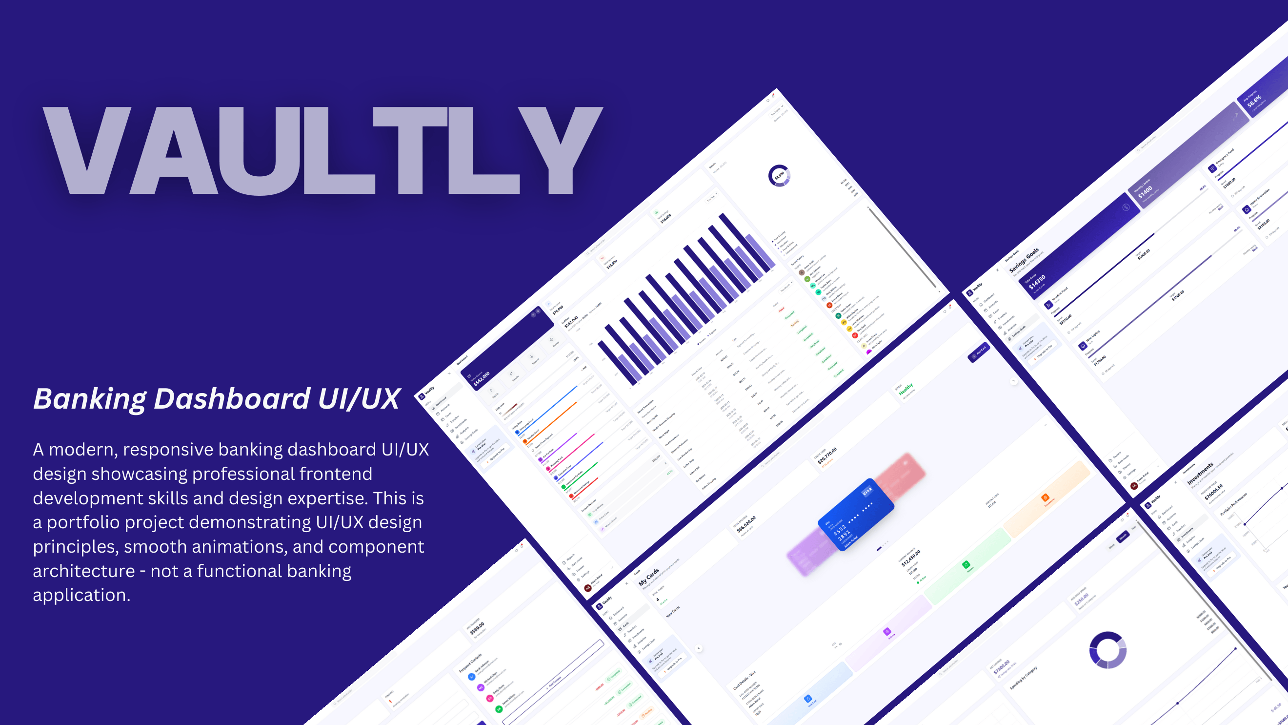
Vaultly - Banking Dashboard UI/UX
A modern, responsive banking dashboard UI/UX design showcasing professional frontend development skills and design expertise.
Banking Dashboard • 2026
Vaultly - Banking Dashboard UI/UX
A modern, responsive banking dashboard designed to simplify personal finance management through intuitive design and interactive data visualization.
Key Features:
- Multi-view dashboard with Dashboard, Accounts, Cards, Transfers, Investments, Analytics, and Savings Goals
- Responsive sidebar navigation with smooth animations and transitions
- Interactive data visualization with real-time financial metrics
- Account management and transaction history tracking
- Investment portfolio overview and performance analytics
- Savings goals tracking with progress indicators
- Professional Persian Indigo color scheme (#27187E)
- Reusable, accessible component architecture
Design & UI:
- Clean, professional interface optimized for financial data
- Consistent design language across all views
- Smooth animations and micro-interactions
- Accessible color contrast and typography
- Responsive grid layout for mobile and desktop
- Interactive charts and data visualizations
- Intuitive navigation and clear information hierarchy
Tech Stack:
- Frontend: React 19, Vite, Tailwind CSS v4
- Animation: Framer Motion for smooth UI transitions
- Icons: Heroicons v2.2.0 for consistent iconography
- Data Visualization: Recharts for interactive charts
- All data is simulated for demonstration purposes
Outcome:
A professional banking dashboard design that demonstrates advanced UI/UX principles, modern component architecture, and polished frontend development. The project showcases expertise in creating accessible, performant, and visually compelling financial applications.
Design Tools
- React 19
- Vite
- Tailwind CSS v4
- Framer Motion
- Heroicons v2.2.0
- Recharts
Category
Banking Dashboard
Year
2026